UX Improvement: Make the Save Preferences Button lighter when it's enabled.
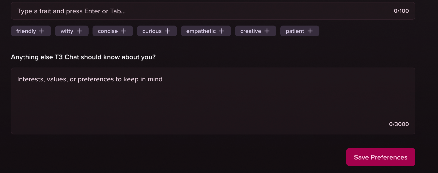
In contrast to the rest of the page, the “Save Preferences“ button is very non-enabled. I wasn’t convinced it was active until I tried to leave and it said I got unsaved changes.
I know, this is the primary color. But if I were to make it a bit lighter, it somehow looks more active:
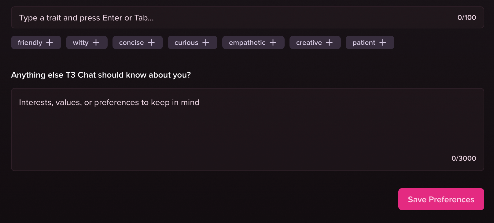
Even the “Submit Post“ button here is a good example for how to do it:

Please authenticate to join the conversation.
Upvoters
Status
Gathering Interest
Board
💡
Feature Request
Subscribe to post
Get notified by email when there are changes.
Upvoters
Status
Gathering Interest
Board
💡
Feature Request
Subscribe to post
Get notified by email when there are changes.