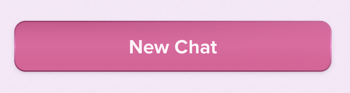
This button looks like trash
This button looks like it was designed by someone who just discovered gradients on borders and went a little too hard. The color scheme screams “Valentine’s Day discount banner,” and the drop shadow/reflection or whatever the heck it is is trying way too hard to be dramatic.
Please authenticate to join the conversation.
Upvoters
Status
Closed
Board
🐛
Bug Reports
Subscribe to post
Get notified by email when there are changes.
Upvoters
Status
Closed
Board
🐛
Bug Reports
Subscribe to post
Get notified by email when there are changes.