Make outdated client notice less obtrusive
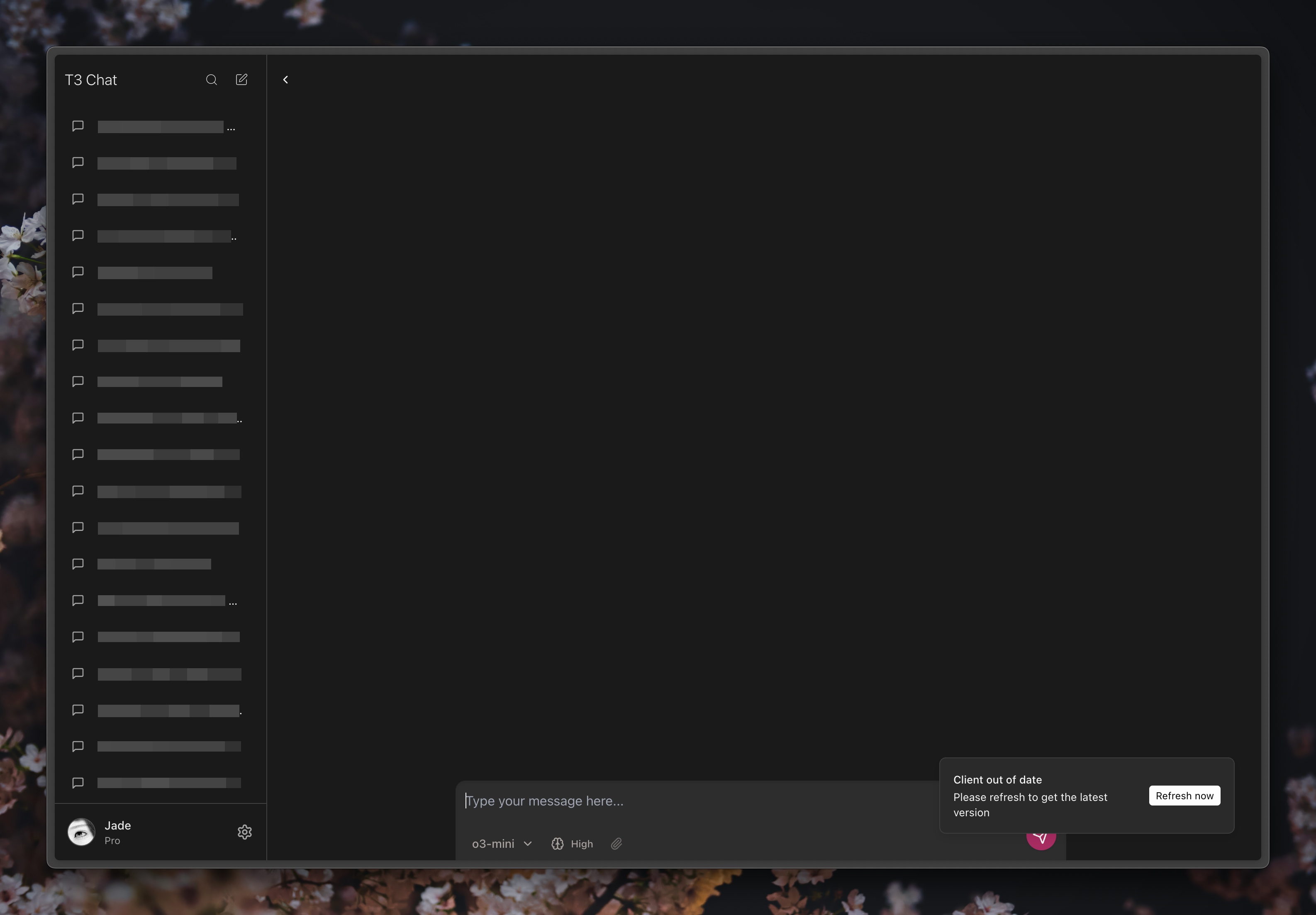
The outdated client notice is pretty large and can cover the send button at certain viewport sizes.
It’s awesome how frequent ya’ll are pushing to prod, however that does have the consequence of making the current notice a bit annoying given the frequency :p
Here’s it covering the send button even at a fairly large viewport:
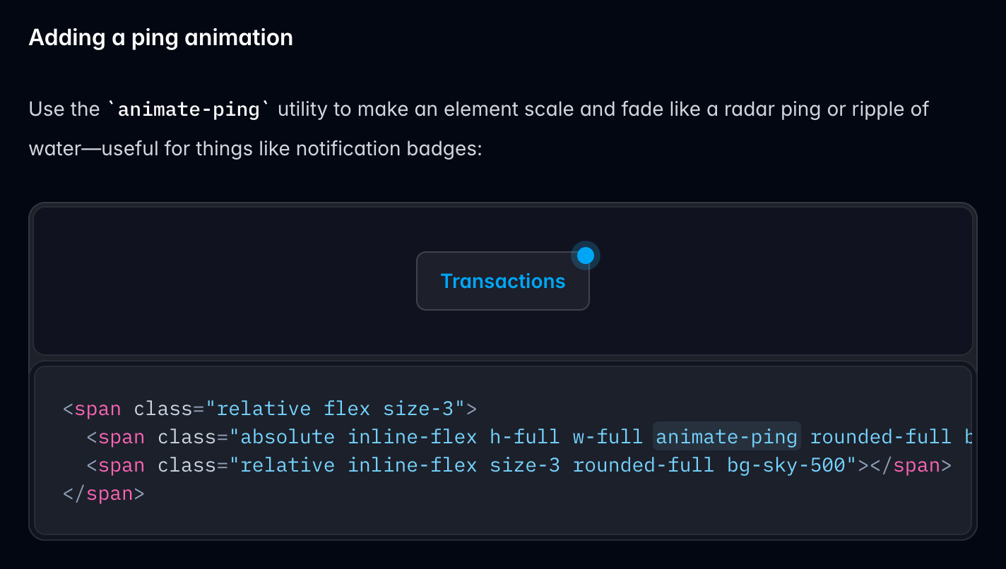
I think something like this Tailwind ping animation example — perhaps on the top left logo — would be perfect:
Please authenticate to join the conversation.
Upvoters
Status
Closed
Board
💡
Feature Request
Subscribe to post
Get notified by email when there are changes.
Upvoters
Status
Closed
Board
💡
Feature Request
Subscribe to post
Get notified by email when there are changes.